unstrungstudio
Saturday, June 28, 2008

I am digging the work on No Pattern, including the Mountain Dew Bottles that Chuck Anderson illustrated.
You should also take a look through Mike Cina's True is True, which features a wide variety of design, illustration and typography.
Friday, June 27, 2008

I am always amazed by the work that was done by the Test Pilot Collective. Created and maintained by Joe Kral, Mike Cina, Matthew Desmond and Graham Hicks, the sheer creativity that drove the creation of the typefaces is astounding. From 1999 to 2003, they posted an astounding number of "Firstpages," which are great examples of visually interesting design. The Test Pilot Collective type collection is commercially available through Veer.
Thursday, June 26, 2008
This is a little bit more complicated than the tower that Meggan and I envisioned, but I guess that is cool. There is a CNN article that explains how the tower will work.
Tuesday, June 24, 2008

Take a look at the posters that were designed by Willi Kunz for the Columbia Graduate School of Architecture, Planning and Preservation. More information is available in this SpeakUp entry. According to Armin, these were printed with metallic inks. The posters are also in MOMA's permanent collection.
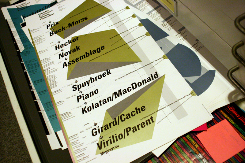
Images courtesy of Kosmograd and SpeakUp.
Monday, June 23, 2008
I am experimenting with some new technology that instantly turns a PDF into a Flash book. This is really valuable when you need to show someone an entire book. The process is easy. You upload a PDF file to Issuu.com, and they send you a link to it. You are given a number of options for linking to or embedding the Flash file, including a mini-browser, which loads quickly. You can even add the file to Facebook. In Issuu's viewer, you can get a complete view of the document, which is large enough to read. A number of large publications are using this solution, including JPG Magazine and Beast Magazine. It's always a good idea to read through the terms before posting your work.


Sunday, June 22, 2008

Daniel Freytag has some excellent work, including a few innovative BBC identities. Take a look at the iriver packaging, too.
Friday, June 20, 2008
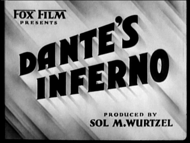
I was recently reminded of type's importance in film titling, while watching the lackluster Indiana Jones and the Kingdom of the Crystal Skull. As I settled into my seat during the opening credits, I was shocked and surprised when I noticed that the longtime Indiana Jones' titling had been changed. The classic serial treatment of Indiana Jones had been replaced with a staid serif. For me, it set the tone for the film that followed. No more rollicking and original action; we were, instead, treated to a film where Indiana had been replaced by Dr. Jones. Upon doing a little research, I was surprised to discover that this actually change occurred during Indiana Jones and the Last Crusade. No doubt, my education has honed my eye for type.
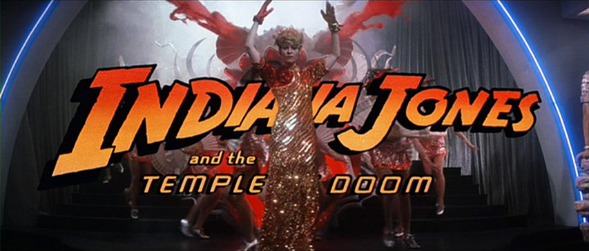
As a lover of movies, I recognize that they are highly choreographed works of art in which many elements combine to form a whole, and even though type is not often considered to be the most important element within this visual medium, its importance should not be underestimated. As Saul Bass illustrated in his film titling, a capable designer can define the visual personality of a film through type and image. Excellent commentary on the contributions of Saul Bass to film titling can be found on Not Coming to a Theater Near You. (You can learn more about the design of Saul Bass in David R. Brown's AIGA Medalist article.)
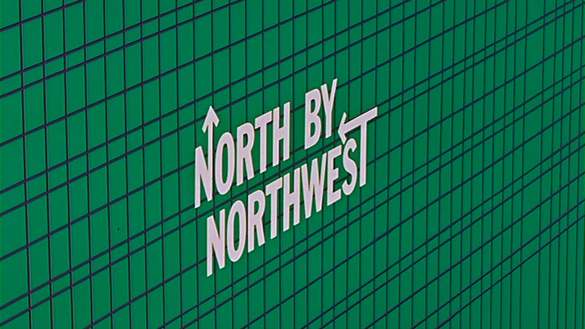
In film, the opportunity to combine type and image seems almost limitless. The examples in this entry came from Steven Hill's Movies Titles Screens Page, a great place to see a variety of styles. You should also check out Forget the Film, Watch the Titles, which aptly features the titling for The Good, The Bad and The Ugly on its homepage.
Tuesday, June 17, 2008

Take a look at Pattern Foundry, a great idea and another addition to the ever growing pool of designer resources. I found it on Quipsologies, but Armin found it on Many Stuff, which is another great find. And, of course, if you are really interested in patterns, jump over to the Wikipedia entry on patterns.
Monday, June 16, 2008
Thursday, June 05, 2008
Wednesday, June 04, 2008
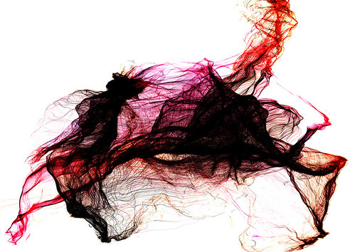
Check out the beautiful work of Eno Henze. This piece is from the collection titled The Human Factor. Picture courtesy of grijsz.
Tuesday, June 03, 2008

Archives
11/01/2003 - 12/01/2003 12/01/2003 - 01/01/2004 01/01/2004 - 02/01/2004 02/01/2004 - 03/01/2004 03/01/2004 - 04/01/2004 04/01/2004 - 05/01/2004 06/01/2004 - 07/01/2004 07/01/2004 - 08/01/2004 08/01/2004 - 09/01/2004 10/01/2004 - 11/01/2004 11/01/2004 - 12/01/2004 12/01/2004 - 01/01/2005 01/01/2005 - 02/01/2005 02/01/2005 - 03/01/2005 04/01/2005 - 05/01/2005 05/01/2005 - 06/01/2005 06/01/2005 - 07/01/2005 07/01/2005 - 08/01/2005 08/01/2005 - 09/01/2005 09/01/2005 - 10/01/2005 10/01/2005 - 11/01/2005 11/01/2005 - 12/01/2005 12/01/2005 - 01/01/2006 01/01/2006 - 02/01/2006 03/01/2006 - 04/01/2006 04/01/2006 - 05/01/2006 05/01/2006 - 06/01/2006 06/01/2006 - 07/01/2006 07/01/2006 - 08/01/2006 08/01/2006 - 09/01/2006 09/01/2006 - 10/01/2006 10/01/2006 - 11/01/2006 11/01/2006 - 12/01/2006 12/01/2006 - 01/01/2007 01/01/2007 - 02/01/2007 02/01/2007 - 03/01/2007 03/01/2007 - 04/01/2007 04/01/2007 - 05/01/2007 05/01/2007 - 06/01/2007 06/01/2007 - 07/01/2007 07/01/2007 - 08/01/2007 08/01/2007 - 09/01/2007 09/01/2007 - 10/01/2007 10/01/2007 - 11/01/2007 11/01/2007 - 12/01/2007 12/01/2007 - 01/01/2008 01/01/2008 - 02/01/2008 02/01/2008 - 03/01/2008 03/01/2008 - 04/01/2008 04/01/2008 - 05/01/2008 05/01/2008 - 06/01/2008 06/01/2008 - 07/01/2008 07/01/2008 - 08/01/2008 08/01/2008 - 09/01/2008 09/01/2008 - 10/01/2008 10/01/2008 - 11/01/2008
![]()
Subscribe to Comments [Atom]